


Why Small Businesses Need Mobile-Friendly Sites
Website Tips
If your small business website isn’t mobile-friendly, you’re losing customers. Here’s why it matters:
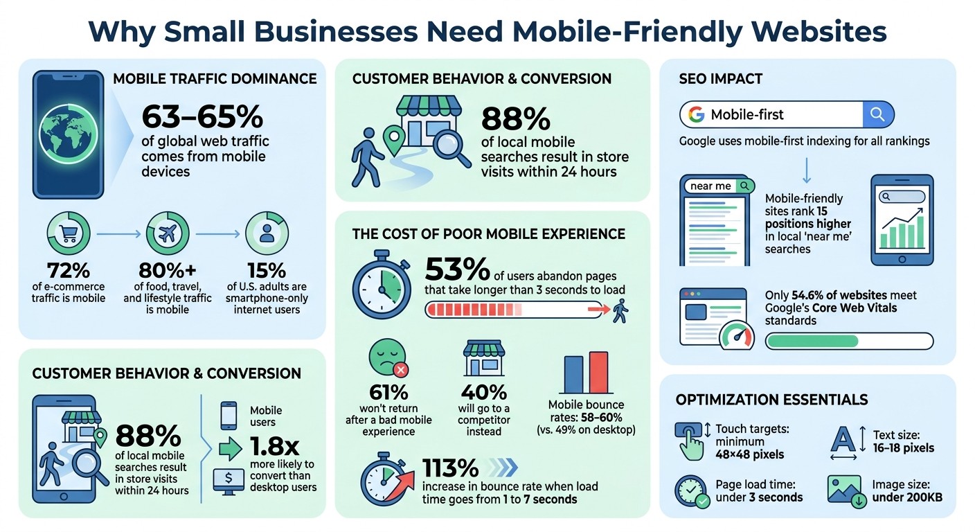
Mobile dominates traffic: Over 60% of global web traffic comes from mobile devices, with industries like e-commerce seeing up to 72%.
Customer behavior: 88% of people who search for local businesses on their phones visit a store within 24 hours.
SEO impact: Google ranks websites based on their mobile version. A poorly optimized site means lower rankings and less visibility.
User expectations: 53% of mobile users leave if a page takes more than 3 seconds to load, and 61% won’t return after a bad experience.
To succeed, prioritize responsive design, fast load times, and touch-friendly navigation. A mobile-friendly site isn’t just nice to have - it’s how you meet customer needs and stay competitive.
Mobile Website Statistics: Why Small Businesses Need Mobile Optimization in 2026
Mobile Traffic Dominates Web Usage
Mobile Traffic Statistics
As of early 2026, mobile devices account for a staggering 63%–65% of global web traffic. This shift has completely transformed how people access the internet. Industries like e-commerce see 72% of their traffic coming from mobile devices, while sectors such as food, travel, and lifestyle report even higher numbers - over 80% of their visitors use mobile devices. These trends highlight how deeply mobile usage is embedded in consumer behavior, especially for local services.
For small businesses, this is a game-changer. A compelling statistic: 88% of consumers who perform a local search on their smartphone visit a physical store within 24 hours. This underscores the importance of catering to mobile users to drive foot traffic and sales.
Why Mobile Users Matter for Small Business Growth
Mobile users don't just browse - they act. They are 1.8 times more likely to convert compared to desktop users. Whether they're searching for directions, making a quick call, or checking business hours, mobile users expect instant results. For small businesses, this means ensuring their websites are mobile-friendly is no longer optional - it’s critical for meeting customer expectations and fueling growth.
Page speed also plays a huge role in the mobile experience. About 53% of users abandon pages that take longer than 3 seconds to load, and 61% won’t return after a poor experience. Losing a mobile visitor often means losing a potential customer altogether.
Another important factor: roughly 15% of U.S. adults are "smartphone-only" internet users, meaning they rely solely on their phones for internet access and don’t have home broadband. For these individuals, a mobile-optimized website isn't just helpful - it’s absolutely essential.
Problems Caused by Mobile-Unfriendly Sites
User Experience and Customer Retention Issues
When a website isn’t optimized for mobile, users are left grappling with awkward pinch-and-zoom gestures just to read text that’s either too small or spilling off the screen. Desktop-style menus tend to break down on touchscreens, leaving visitors stranded without proper navigation.
The numbers paint a stark picture: mobile bounce rates hover between 58% and 60%, noticeably higher than the 49% average seen on desktops. This means that on a site lacking mobile optimization, roughly 60 out of every 100 mobile visitors will leave without engaging. Even worse, if your site’s load time increases from 1 to 7 seconds, mobile bounce rates can skyrocket by 113%.
Seemingly minor design flaws can lead to major frustrations. Overcrowded buttons often result in accidental clicks or "fat-finger" errors. Phone numbers that aren’t clickable force users to manually type them out. And small, hard-to-navigate forms discourage users from completing them. All of this adds up to a grim outcome: 61% of users are unlikely to return to a mobile site they struggled with, and 40% will head straight to a competitor instead.
SEO Penalties for Mobile-Unfriendly Sites
The issues don’t stop at user experience; mobile-unfriendly sites also face stiff penalties from search engines. With Google’s mobile-first indexing, the search engine evaluates and ranks your site based primarily on its mobile version - not the desktop one. As Digital Applied explains: "Mobile-first indexing is no longer a transition - it is the permanent reality of how Google crawls and ranks the web". If your mobile site lacks content, links, or structured data compared to your desktop version, your rankings will take a hit across all devices.
Google specifically flags usability issues as negative ranking signals, such as tap targets smaller than 48×48 pixels, font sizes under 16px, and content that requires horizontal scrolling. Additionally, the search engine evaluates Core Web Vitals - factors like loading speed, visual stability, and interactivity - on mobile devices using 4G connections. Falling short in these areas directly impacts your rankings. Ryan Johnson, Owner & Web Strategist at RJ Digital, puts it bluntly:
"If your site isn't mobile-optimized, Google literally ranks you lower in search results".
For local businesses, the stakes are even higher. Mobile-friendly sites tend to rank an average of 15 positions higher in local "near me" searches. That difference can determine whether your business gets noticed or overlooked entirely.
How to Make Your Website Mobile Friendly; Your Guide to Responsive Design
How to Optimize Your Site for Mobile
With mobile usage at an all-time high, ensuring your site is mobile-friendly isn't just a bonus - it's essential for keeping users engaged and avoiding lost opportunities.
Responsive Design and Simple Navigation
A mobile-first design is the backbone of mobile optimization. Tools like CSS Grid and Flexbox can help create layouts that adapt seamlessly to different screen sizes. Simplifying navigation is equally important: make it intuitive and thumb-friendly. Place key navigation elements within the bottom 40% of the screen - where thumbs naturally rest. While hamburger menus might save space, they can reduce content visibility by up to 50%. Instead, consider bottom tab bars or menus that remain visible.
Ensure vital information - like your business identity, offerings, and contact details - is immediately visible at the top of the page. This avoids the need for users to scroll. Additionally, set the viewport meta tag correctly with <meta name="viewport" content="width=device-width, initial-scale=1.0"> to ensure proper scaling. For text, use the CSS clamp() function to allow smooth resizing across devices, and stick to body text sizes of 16–18 pixels with a line height of 1.5 to 1.6 for better readability.
Speed and Performance Optimization
Page load speed is a make-or-break factor for mobile users. If your site takes longer than 3 seconds to load, 73% of visitors might leave. Every additional second of delay can slash conversions by around 20%. Since images often make up 50–70% of a page's weight, optimizing them should be a priority.
Switch to modern image formats like WebP or AVIF, which are 30–50% smaller than traditional JPEGs. Aim for images under 200KB, with a maximum width of 1,200 pixels for hero images and 800 pixels for product photos. Use the loading="lazy" attribute for images below the fold to speed up initial load times. Explicitly define width and height for all media to enhance Core Web Vitals and avoid layout shifts.
Take Sarah, a restaurant owner in Richmond, as an example. In January 2026, she reduced her site's load time from 15.2 seconds to 2.1 seconds by compressing images, enabling lazy loading, and deferring scripts. Her mobile PageSpeed score soared from 28 to 91, and her weekly online orders skyrocketed from 45 to 132 - a 193% increase. Beyond images, eliminate unnecessary plugins, delay non-essential scripts, and consider using a CDN to cut load times by as much as 70%.
Touch-Friendly Interfaces
Since mobile users rely on touch, buttons and links need to be easy to tap. Make sure touch targets are at least 48×48 pixels with an 8-pixel gap between them to avoid accidental clicks. Use CSS padding to expand tappable areas without altering the visual size of buttons.
Hover effects don’t translate well to touchscreens, so replace them with :active states for immediate feedback. Adding touch-action: manipulation to buttons can prevent unwanted zooming when users double-tap. For convenience, wrap phone numbers in tel: links so users can call with a single tap.
Forms should be optimized for mobile too. Use inputmode attributes (like numeric, tel, or email) to trigger the appropriate virtual keyboard. For dropdowns with fewer than seven options, swap them for radio buttons or segmented controls to simplify interaction. Additionally, streamline forms by displaying one field per screen for essential processes.
Testing and Regular Updates
Testing on actual devices is crucial. While emulators and desktop browsers are helpful, physical device testing uncovers about 60% more usability issues. Tools like Google’s Mobile-Friendly Test are great starting points, but nothing beats real-world testing on smartphones and tablets.
Keep an eye on Core Web Vitals monthly. Aim for a Largest Contentful Paint under 2.5 seconds and a Cumulative Layout Shift below 0.1. With only 54.6% of websites currently meeting Google’s Core Web Vitals standards, regular testing is essential. This practice ensures you catch and resolve issues before they affect user experience or search rankings.
Building a Mobile-First Website
Why Mobile-First Design Works
Mobile-first design flips the traditional approach on its head. Instead of designing for desktops and then shrinking everything down, you begin with the smallest screen - smartphones - and work your way up. This method ensures that the essentials, like business hours, location, contact info, and core services, are front and center. With mobile traffic leading the way and local searches converting more effectively, focusing on mobile-first design directly supports business growth.
Google's move to mobile-first indexing in 2021 highlights just how crucial this approach is. Now, your site's mobile version is what Google primarily uses for ranking and indexing. If your mobile site is clunky or incomplete, your search rankings could take a hit, no matter how polished your desktop version looks. As Monsoft Solutions aptly stated, "Mobile-first design isn't a trend. It's the baseline expectation in 2026".
"It is easier and more economical to scale up from a simple, mobile-optimized design to accommodate larger screens than to strip down a desktop-first design for mobile" - Mike Funkhouser, Founder of Agency Helper.
By starting with mobile, you avoid common pitfalls like awkward layouts, unnecessary code, and features that don’t work well on touchscreens. Plus, this approach has a proven track record of boosting user engagement and search performance. Pairing mobile-first design with tools that simplify responsive design can take your strategy even further.
Using Responsive Platforms Like Gatsboy

You don’t need to be a coding wizard or have a massive budget to create a mobile-first website. Platforms like Gatsboy make it easy by offering responsive templates that automatically adjust to different devices, from iPhones to tablets to desktops. Their Framer-based no-code editor lets you update content, tweak layouts, and add features like image galleries - all without writing a single line of code.
Gatsboy goes beyond basic design by automating key mobile optimizations. These include minifying code, lazy loading images, and adding schema markup, ensuring your site aligns with mobile-first indexing requirements. Features like click-to-call phone numbers, lead tracking, Google Reviews integration, and Stripe payments are all managed within a single dashboard, eliminating the need for extra plugins.
For small businesses, this means you can launch a professional, mobile-optimized site quickly and efficiently. Your site will load fast on smartphones, look great on all devices, and meet Google's Core Web Vitals standards - all while you focus on running your business.
Conclusion
Having a mobile-friendly website is no longer optional - it's a must-have for any business. With more than 60% of web traffic coming from mobile devices and Google giving priority to mobile-optimized sites, businesses that fail to adapt risk losing both customers and revenue. A poor mobile experience doesn't just annoy users; it drives them away. In fact, 88% of users are unlikely to return after a bad mobile experience, directly impacting your bottom line.
The advantages of mobile optimization are undeniable: better user experiences, higher search engine rankings, improved conversion rates, and even lower maintenance costs. When users can quickly find what they need on your site, they’re far more likely to choose you over competitors. These improvements don’t just enhance customer satisfaction - they contribute directly to your business's growth and efficiency.
The good news? Making these changes doesn’t have to be complicated or expensive. Today’s tools and platforms make it easy to create responsive websites that work seamlessly across all devices. Focus on these essential website elements: fast loading times (under 3 seconds), buttons that are easy to tap (at least 44px), and simple navigation that highlights your most important content.
FAQs
How can I tell if my site is mobile-friendly?
To determine if your site is mobile-friendly, start by checking how it performs on smaller screens like smartphones. Does it load fast? Is it easy to navigate? Does the content display clearly without needing to zoom or scroll horizontally? These are key indicators of mobile usability.
For a more detailed analysis, try tools like Google's Mobile-Friendly Test. It provides insights into potential problems and offers tips to improve your site's usability. A smooth mobile experience not only keeps users happy but also makes your site more accessible to everyone.
What are the fastest ways to speed up my mobile site?
To make your mobile site load faster, try these steps:
Compress and resize images to cut down load times without sacrificing quality.
Enable browser caching so returning visitors experience quicker page loads.
Simplify your code and scripts by removing anything unnecessary.
Design with mobile in mind first to ensure smooth performance from the beginning.
These steps not only improve your site's speed but also enhance user experience and boost search engine visibility.
What mobile issues hurt my Google rankings the most?
Some of the biggest culprits behind poor Google rankings on mobile include slow site speed, confusing navigation, and designs that aren't responsive to mobile screens. Since Google's ranking algorithm favors mobile-friendly websites, fixing these problems is essential to boost both your search visibility and the experience users have on your site.
Related Blog Posts
Únete a nuestra comunidad de 15,000+ propietarios de negocios
Artículos populares
Artículos populares sobre su sitio web y la comercialización de su pequeña empresa


